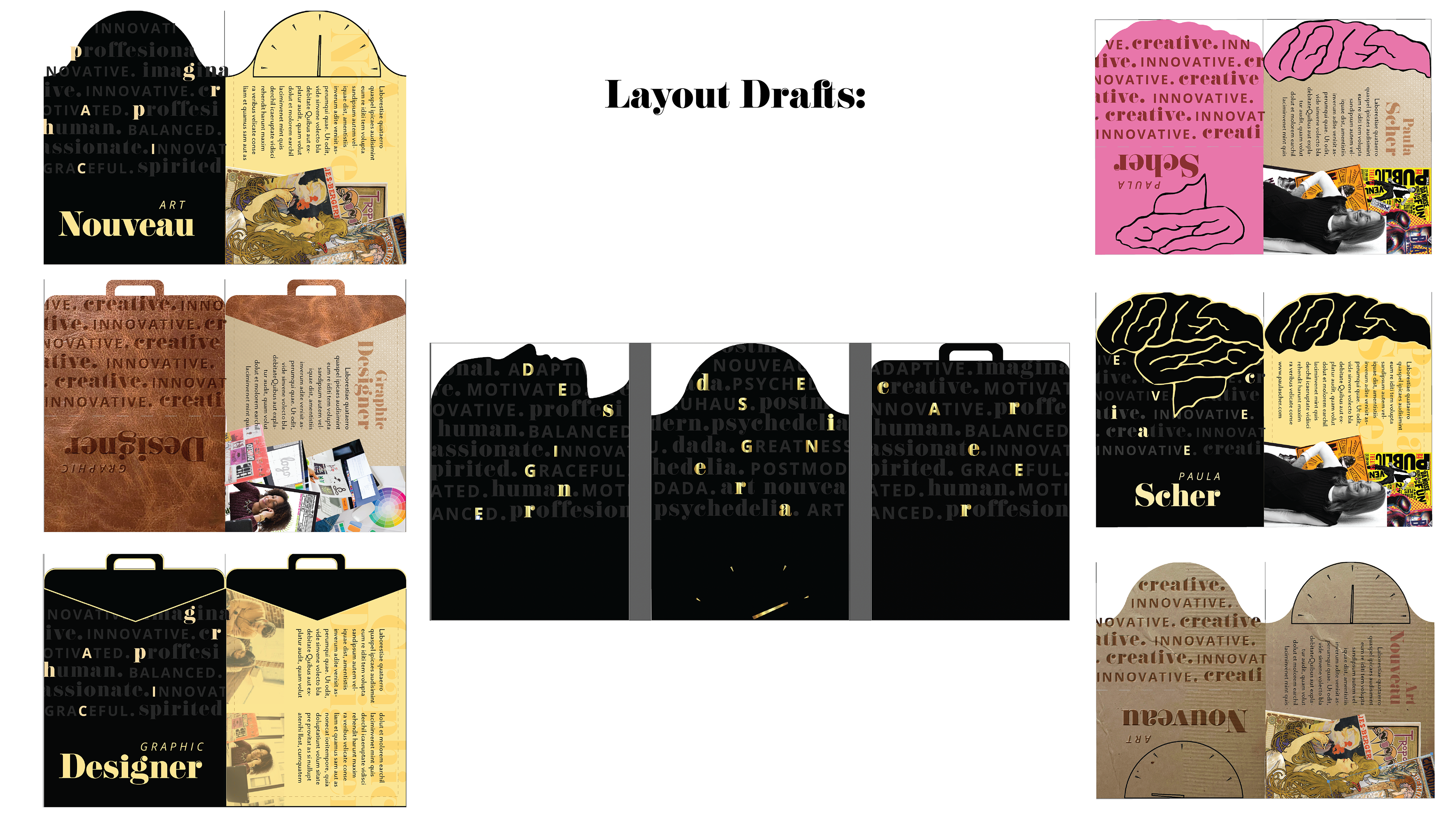
These trading cards were designed as a visual system to educate beginner designers about various designers, careers, and design eras that they will soon know very well. Each category is defined by its respective dye-cut edge: designer profile, designer career briefcase, and design era clock. These cards push the boundaries and functionality of typical trading cards by folding into themselves, reducing storage space and contributing to the seamless visual system. I enjoyed the creation of this visual system as it allowed me to push my creative abilities and to expand the functionality of a basic trading card by asking “How can I push the boundaries of this simple concept?”
Final Deliverables
Printed Collateral & System Design to include:
Custom Illustration and Type Pattern
Trading Card Designs
Custom Die-Lines
System Design
20 Printed Trading Cards
Design Process
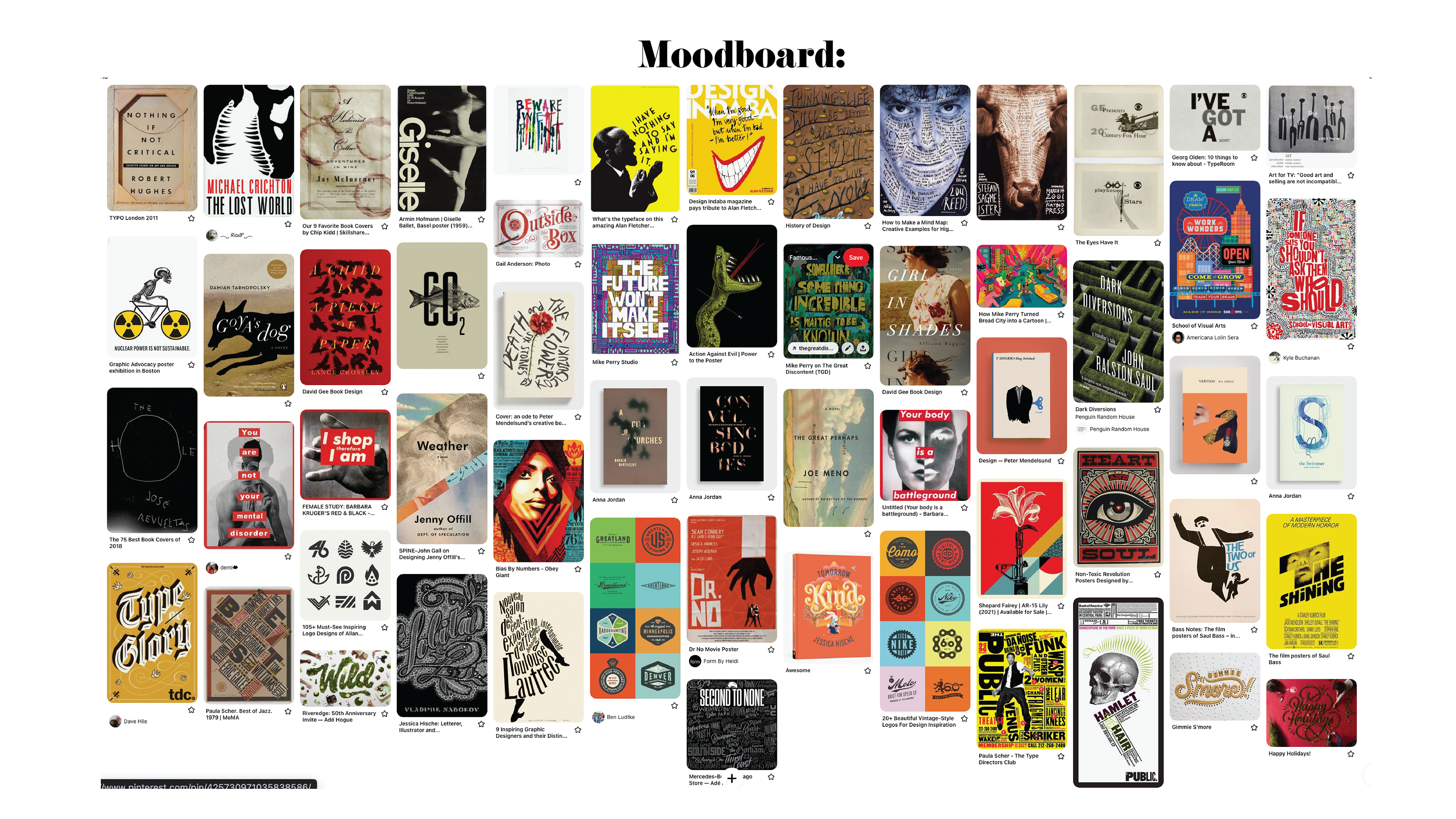
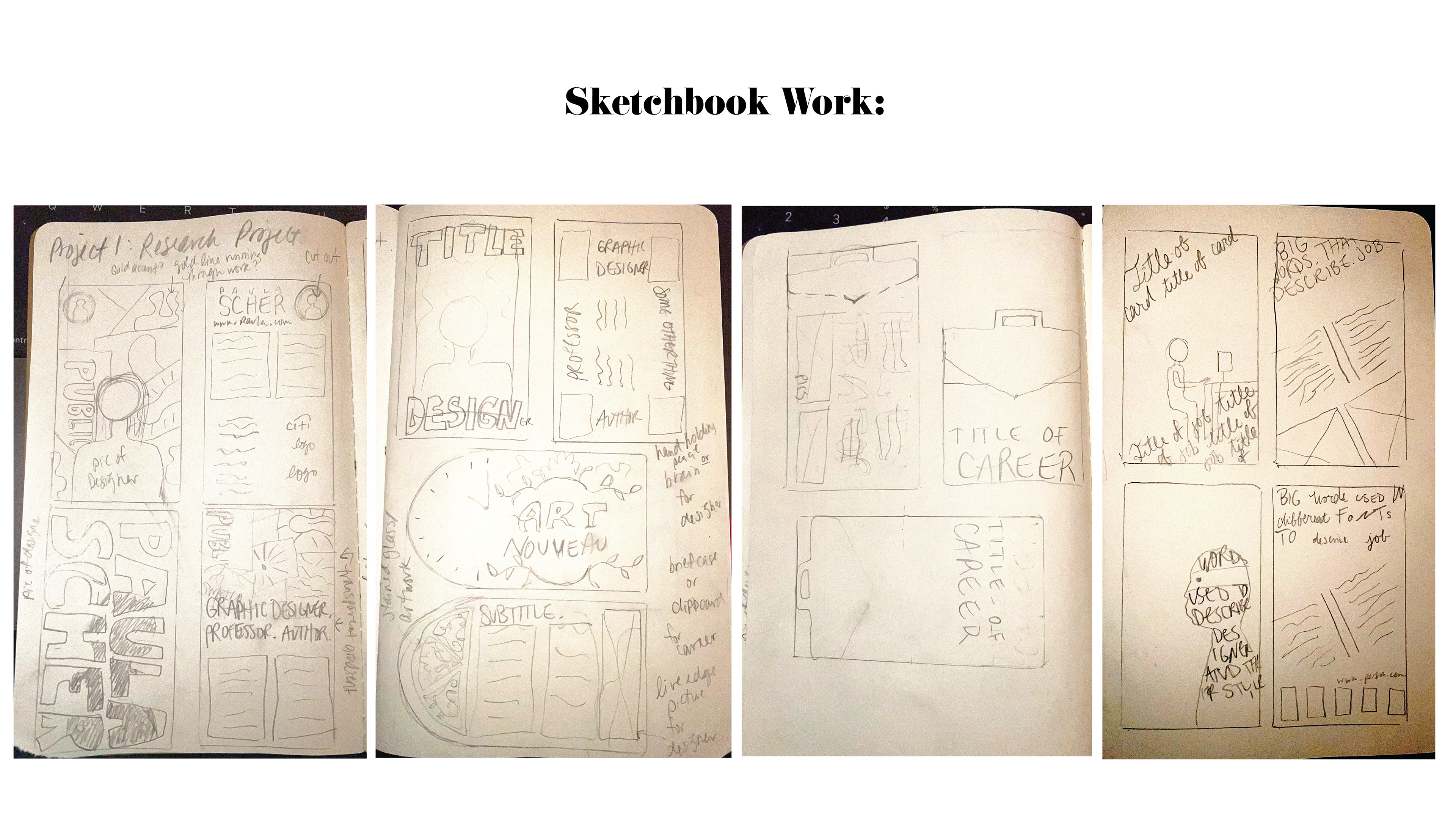
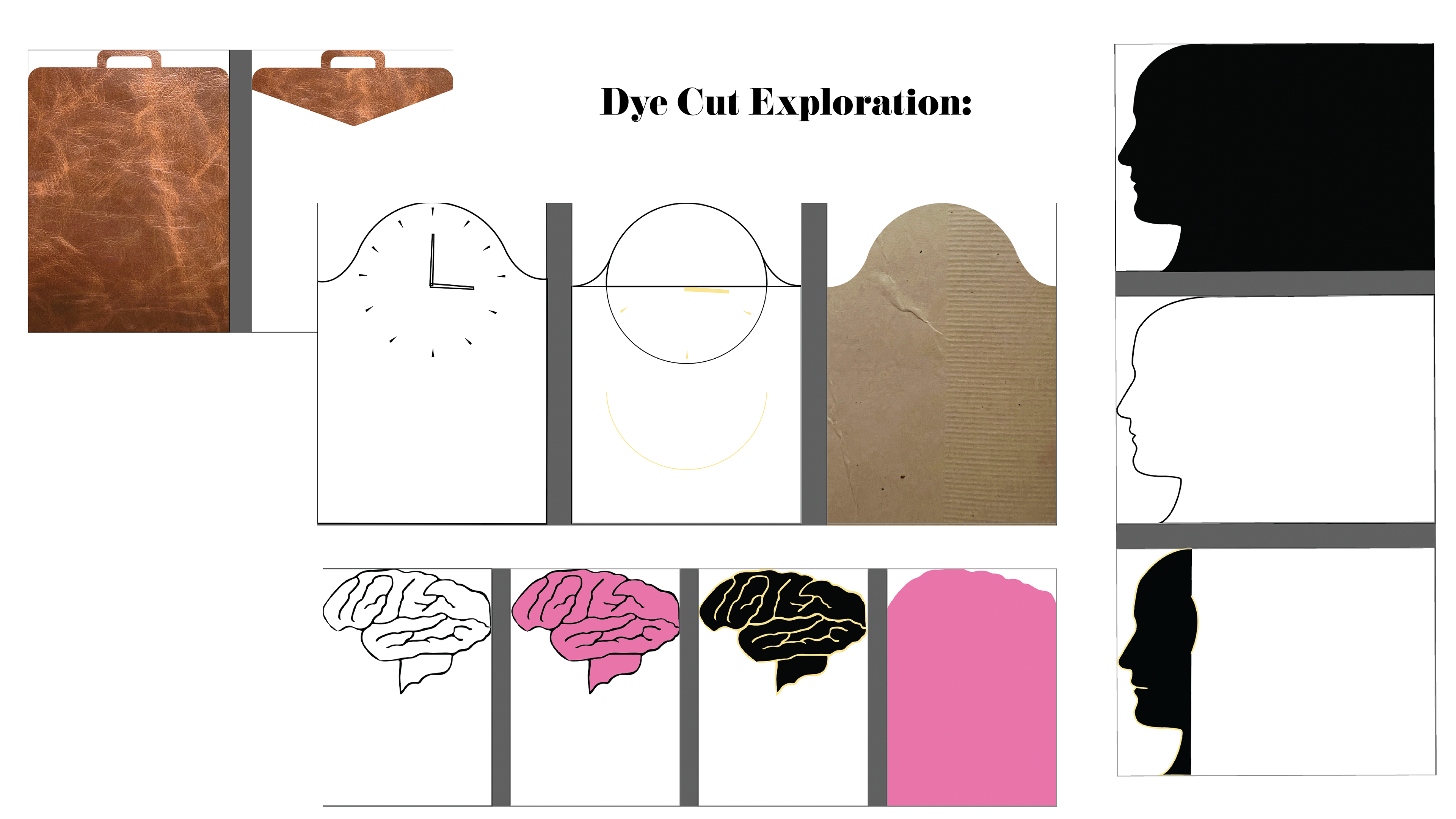
My design process began with the creation of a mood board and sketching 4 concepts for the trading card designs, each concept including the designs for the 3 categories of the cards' content. In my concept work I found that I wanted to do a dye-cut edge to highlight the differentiation of the categories, and spent time exploring what I wanted each dye-cut edge to look like. I chose the color palette of black and gold because this combination is striking and dramatic, and is minimalist with respect to the colorful interior contents of each card. To push the boundaries of the traditional trading card, I decided that I wanted each card to open like a folder to reveal the inner content. I staggered the imagery included within each card to create the illusion of the artwork 'falling out' of the card when you open it, which includes some movement and action to each card as the viewer opens each of them.
