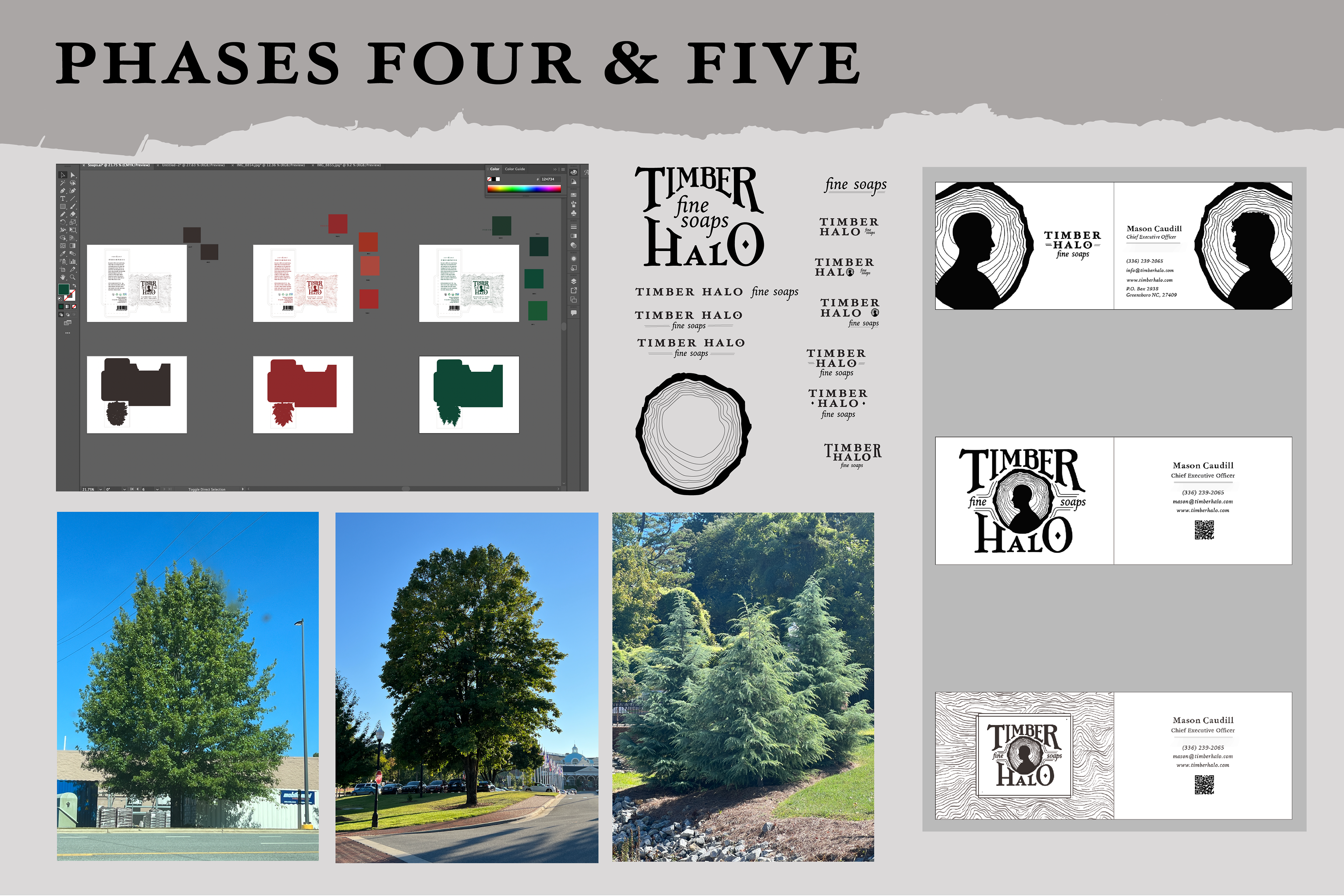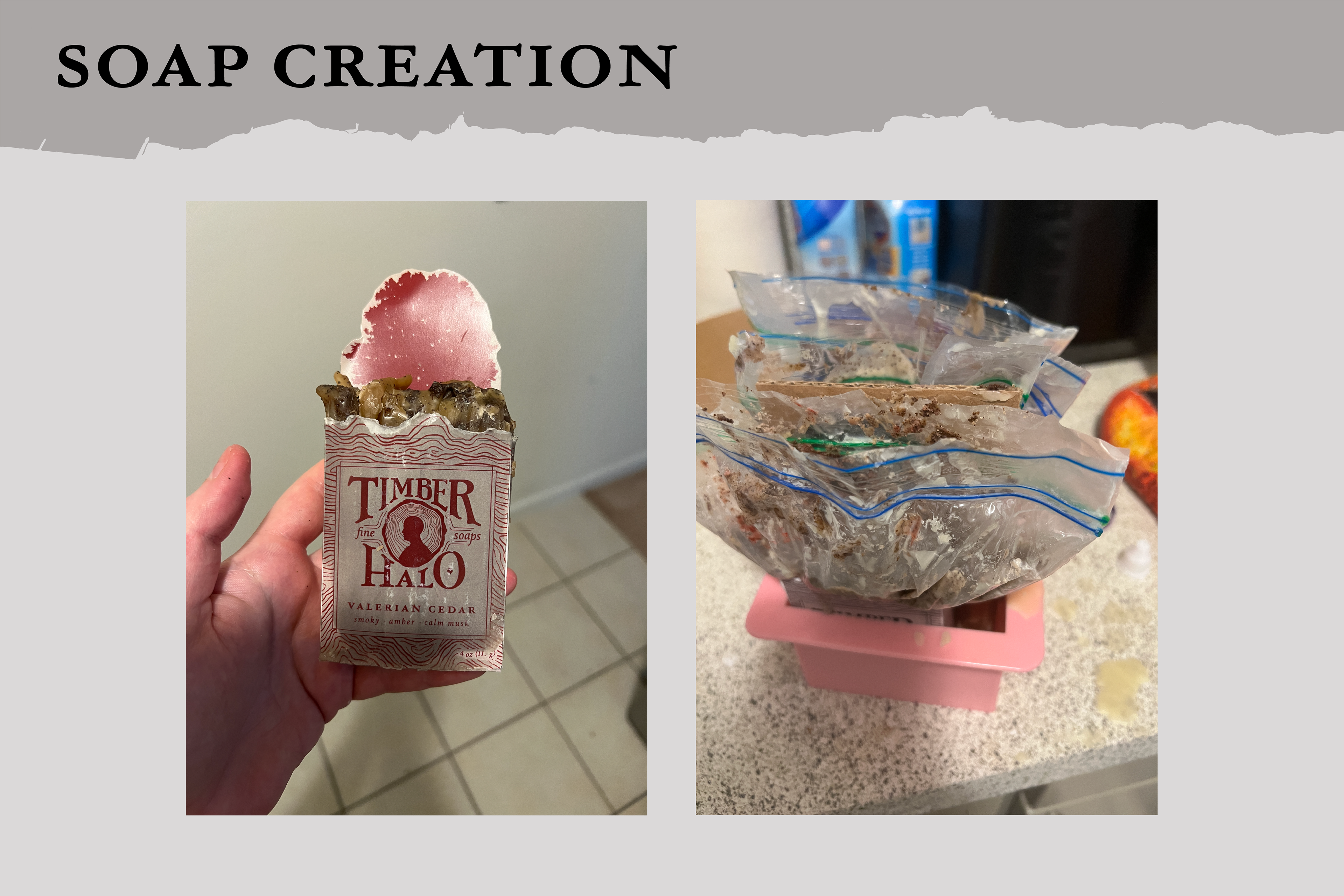
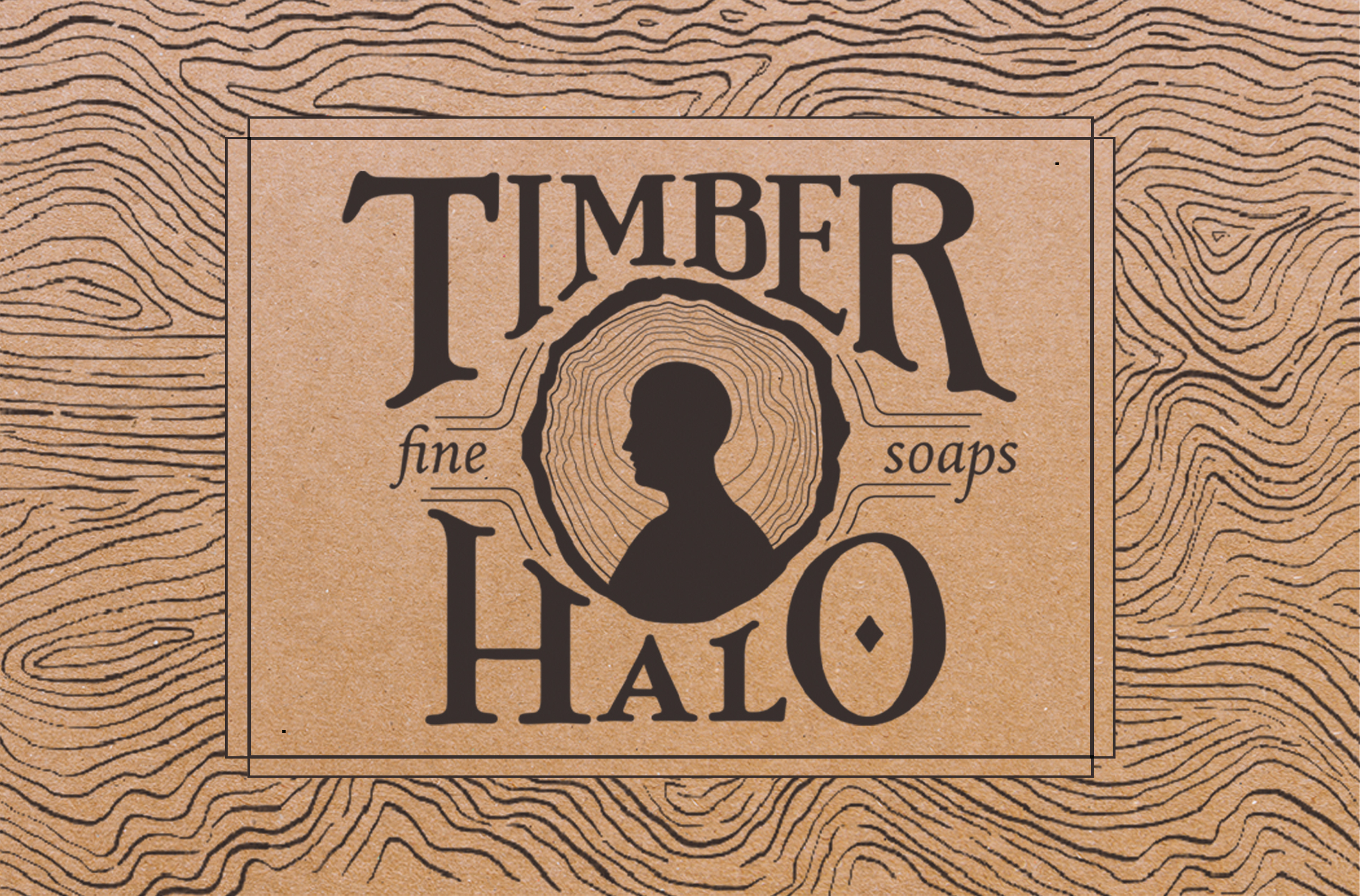
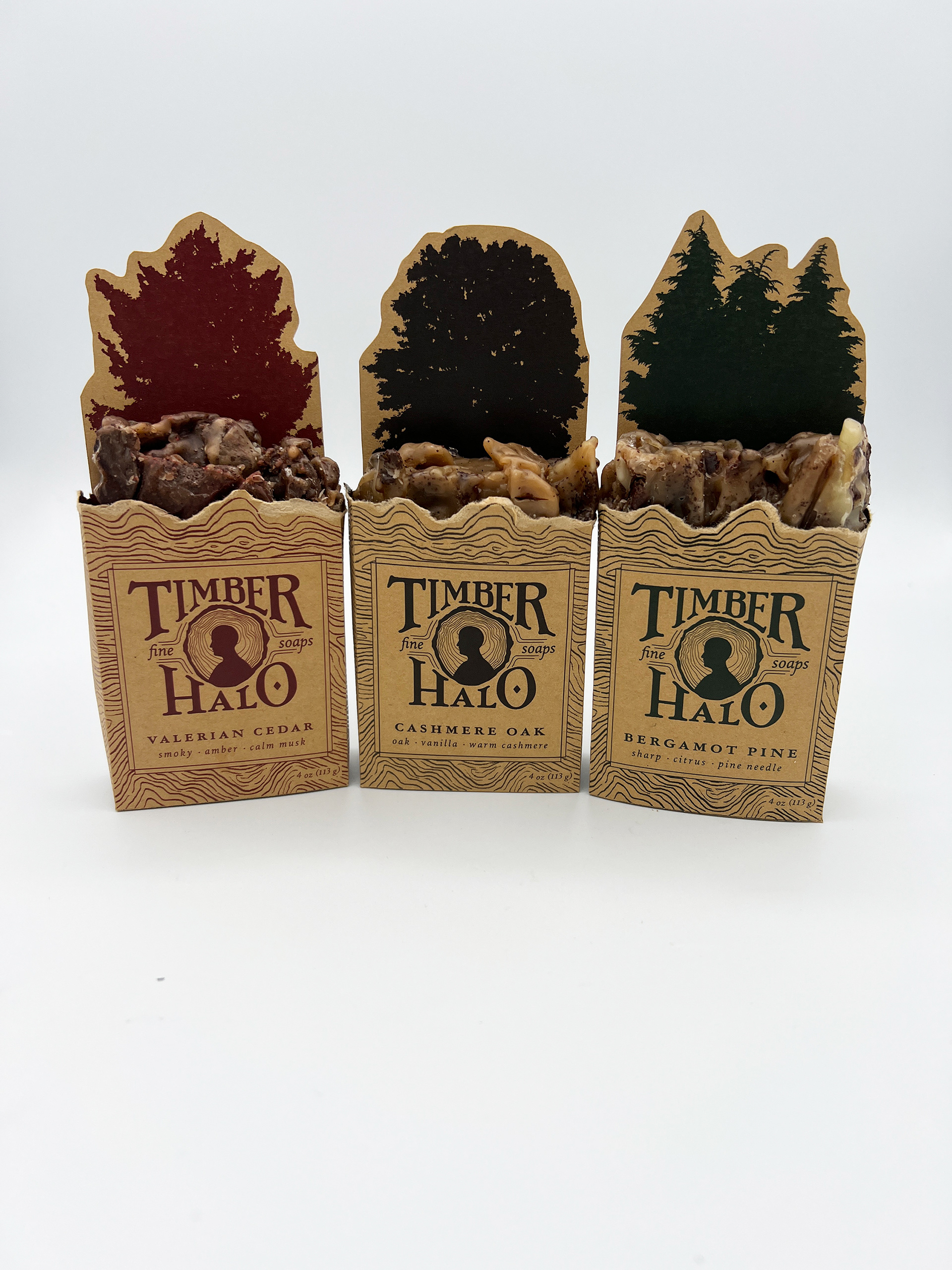
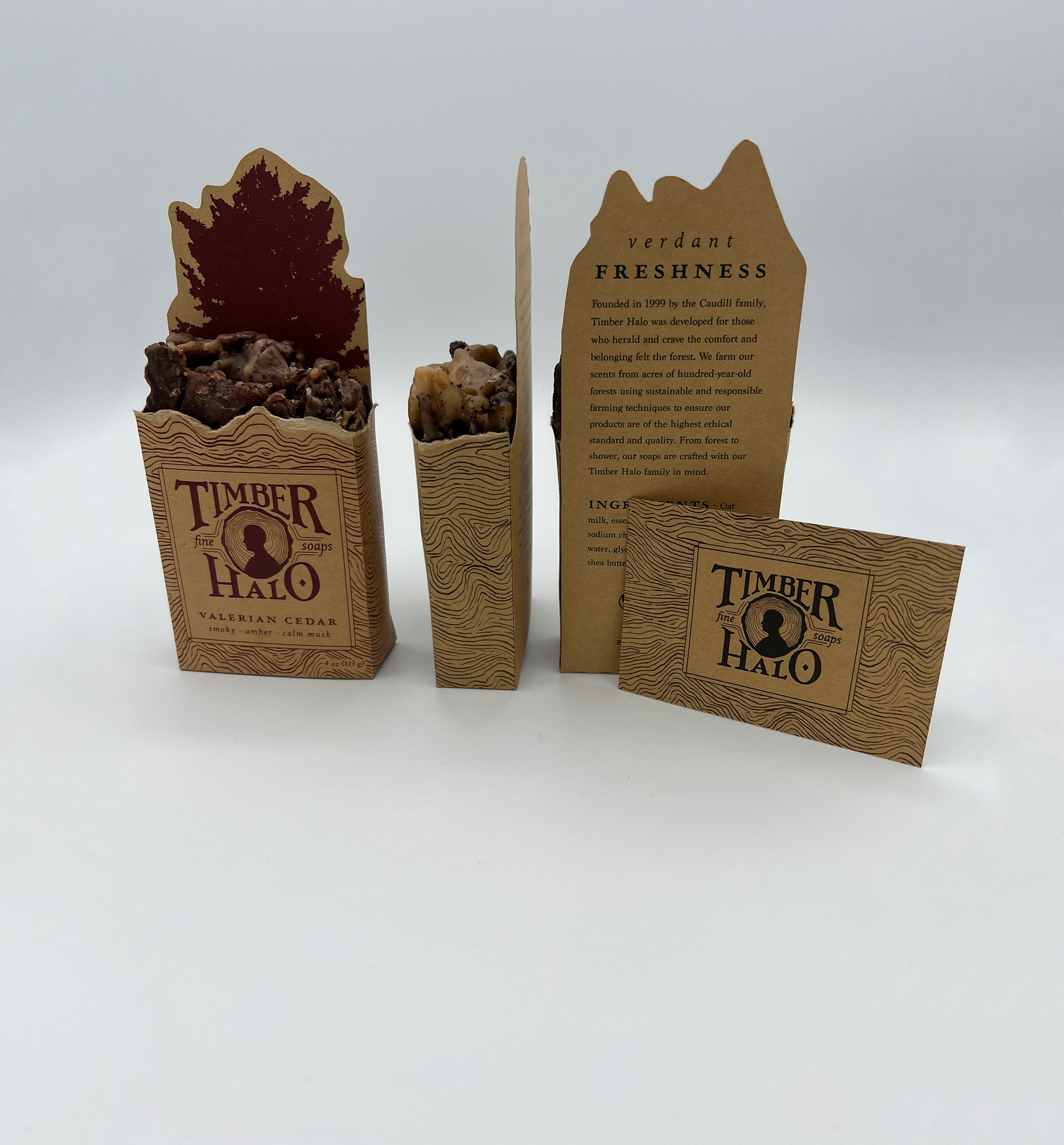
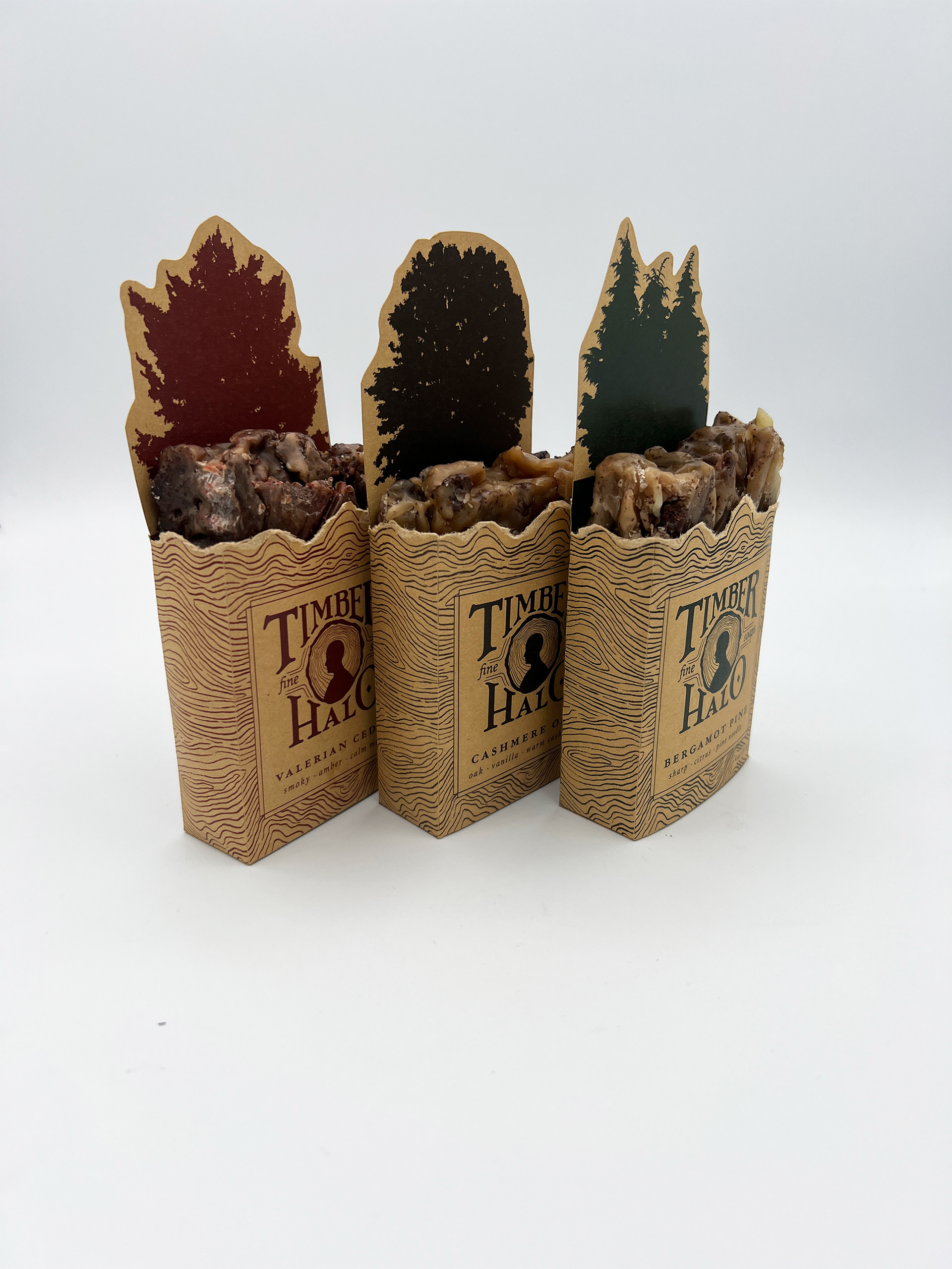
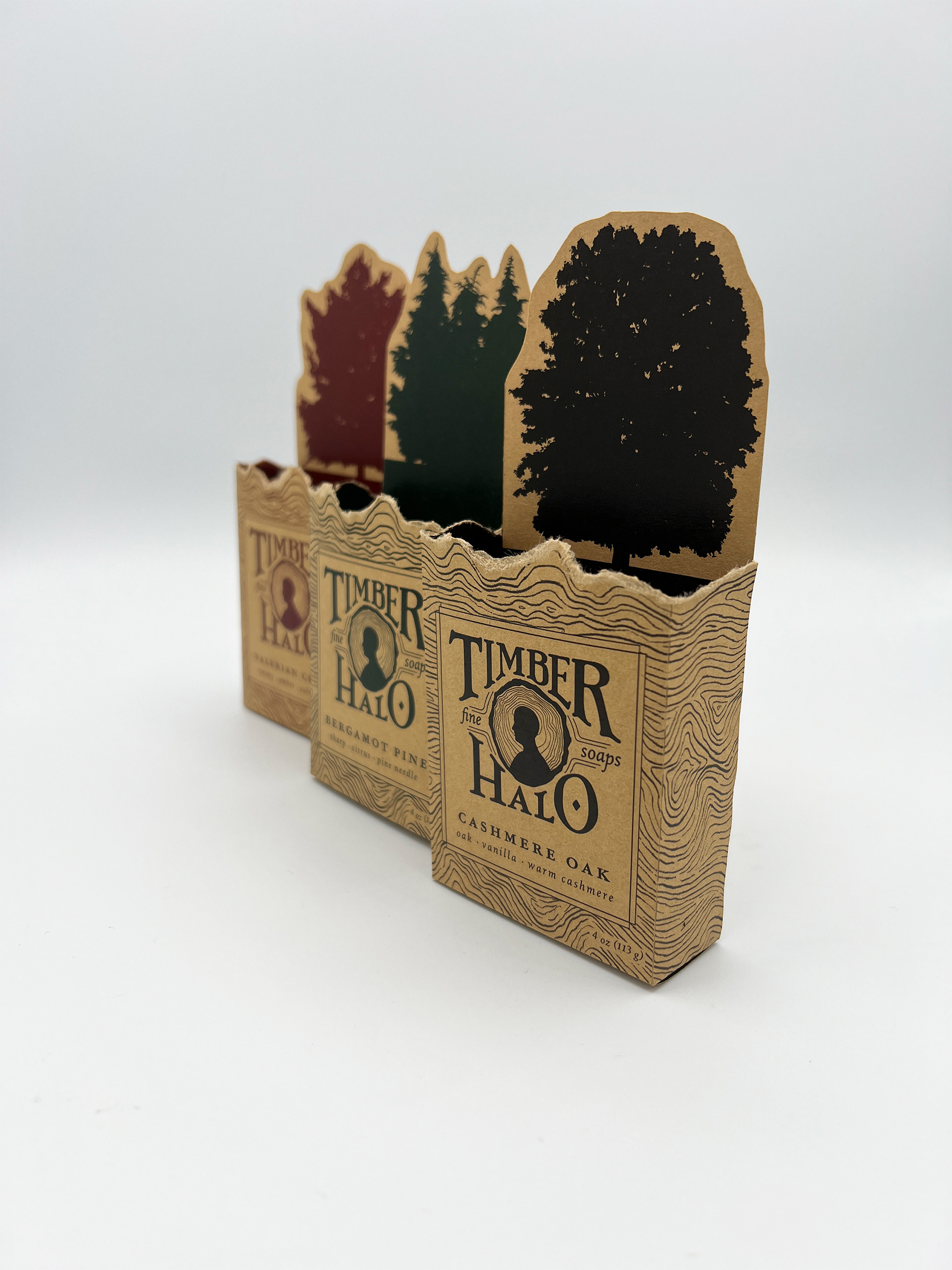
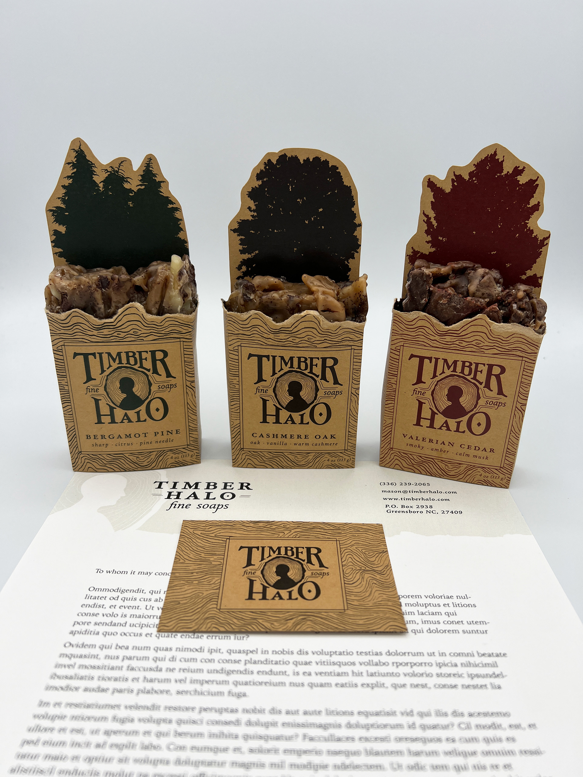
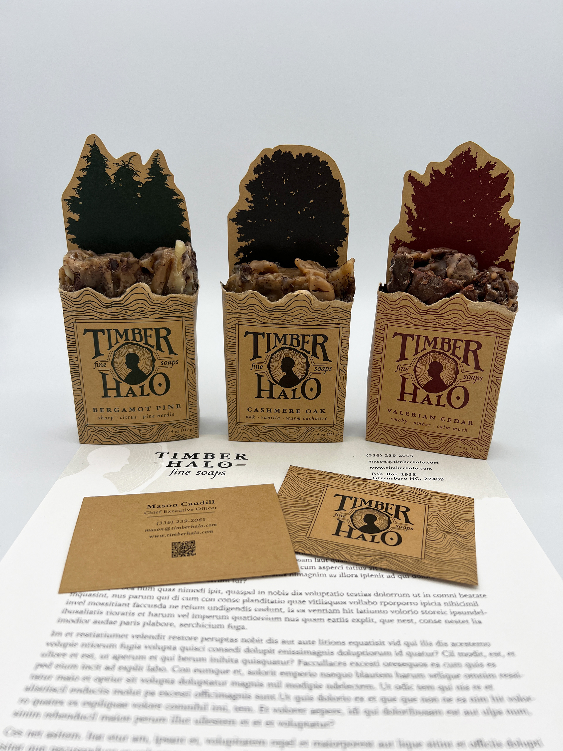
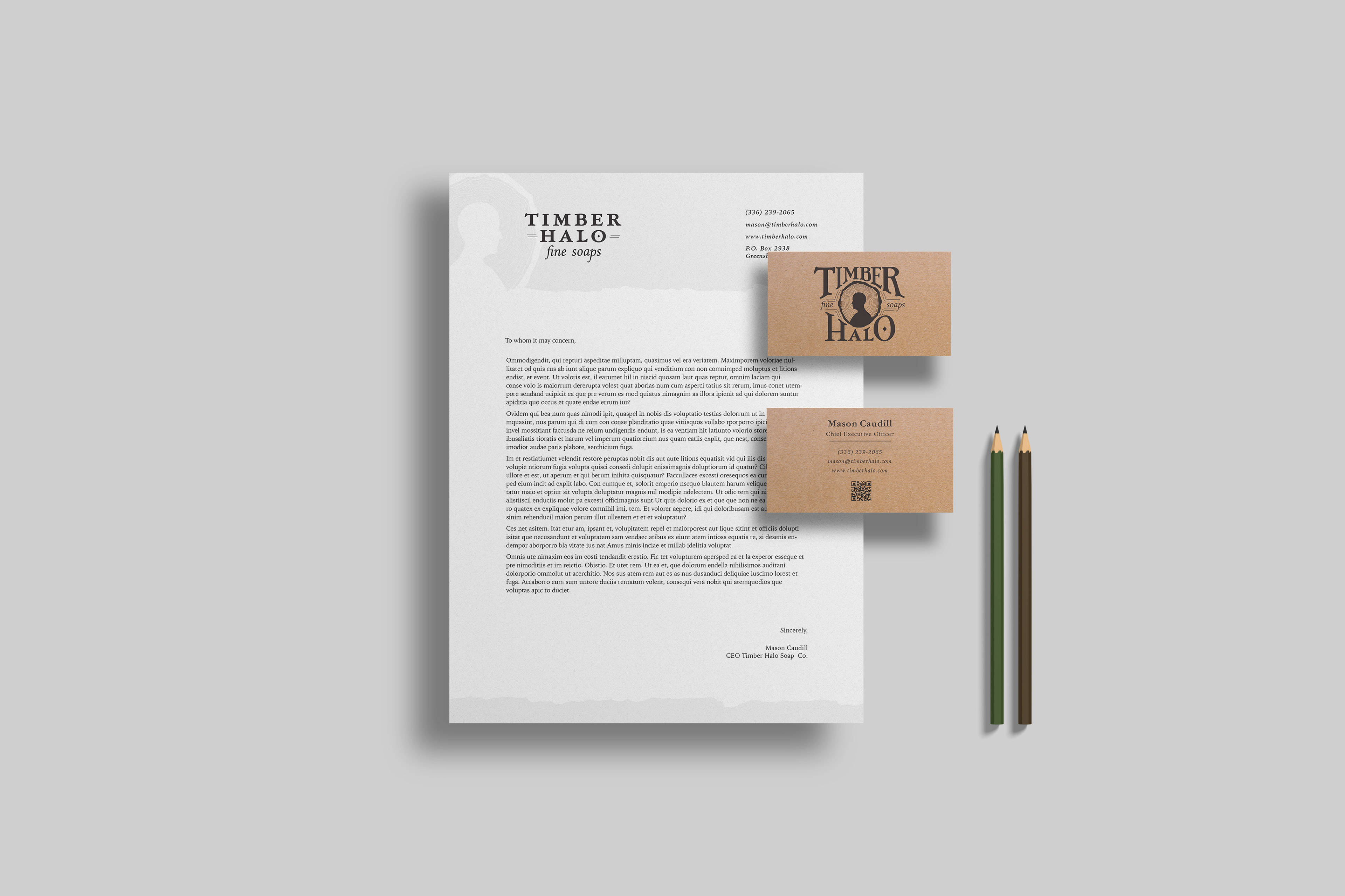
Timber Halo Fine Soaps is a business proposal for a line of timber-scented soaps. For the brand imagery, I was inspired by the silhouettes of trees and the rings they earn with time, and the silhouettes represented in vintage cameos. This soap line was created with luxury and sustainability in mind, with brand collateral to accompany the soap boxes to include a letterhead and business cards. I chose the typefaces Garamond and Iowan Old Style to reinforce a vintage but natural brand aesthetic. I also altered the logotype to curve around the logo form to allow for a nicely squared logo. I chose the color palette to reflect the natural color of each tree represented in each soap scent, and created a custom die-line for each package design to reflect the silhouette of each tree scent and to allow the customer to have an immersive brand experience.
My Timber Halo Fine Soaps brand design project has been recognized by Graphis Inc. in their 2024 New Talent Annual competition by winning an Honorable Mention in the Branding and Design categories.
Final Deliverables
Printed Collateral & Brand Design to include:
Primary & Alternate Logos
Pattern Design
3 Package Designs
Business Card Designs
Letterhead Design


Design Process
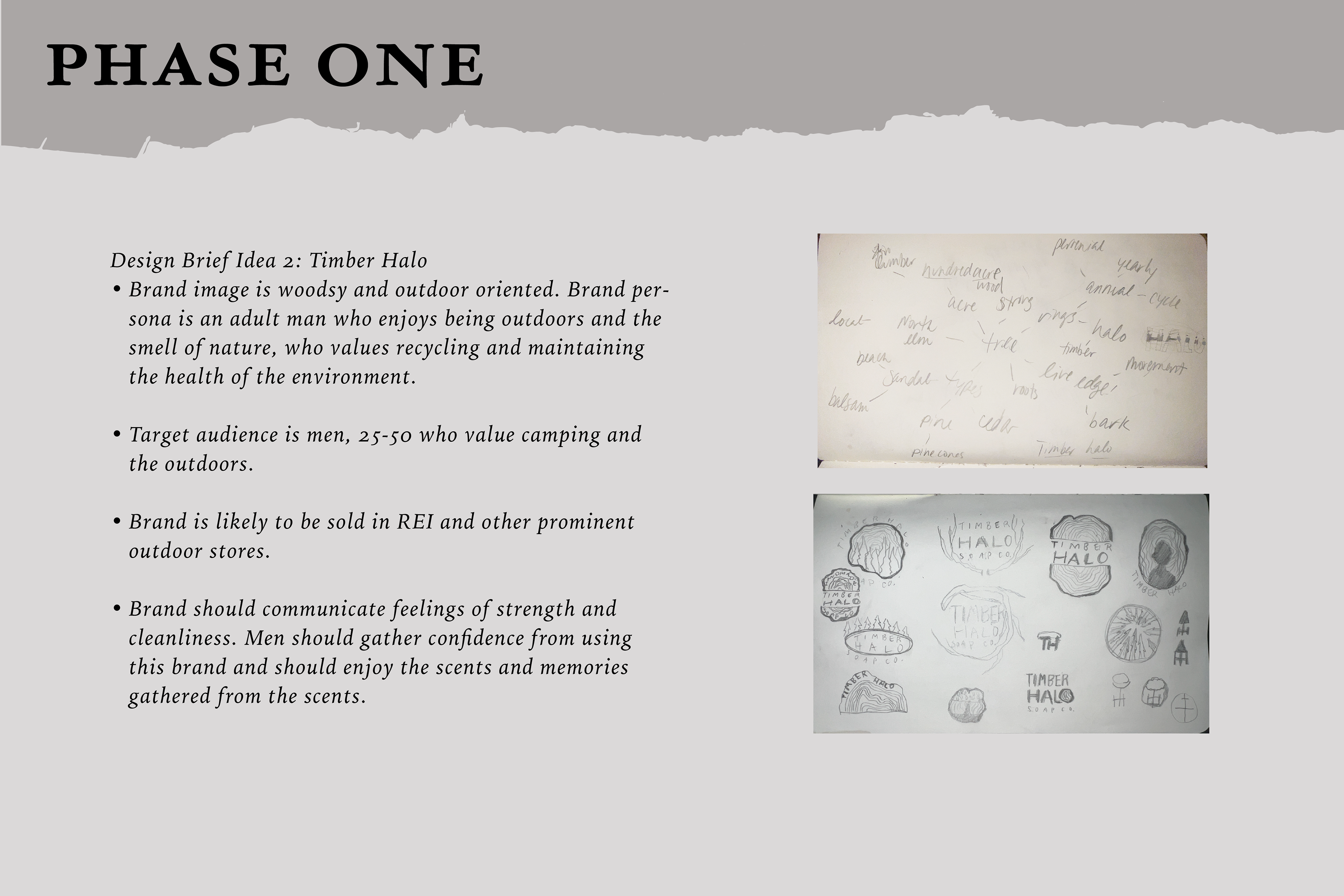
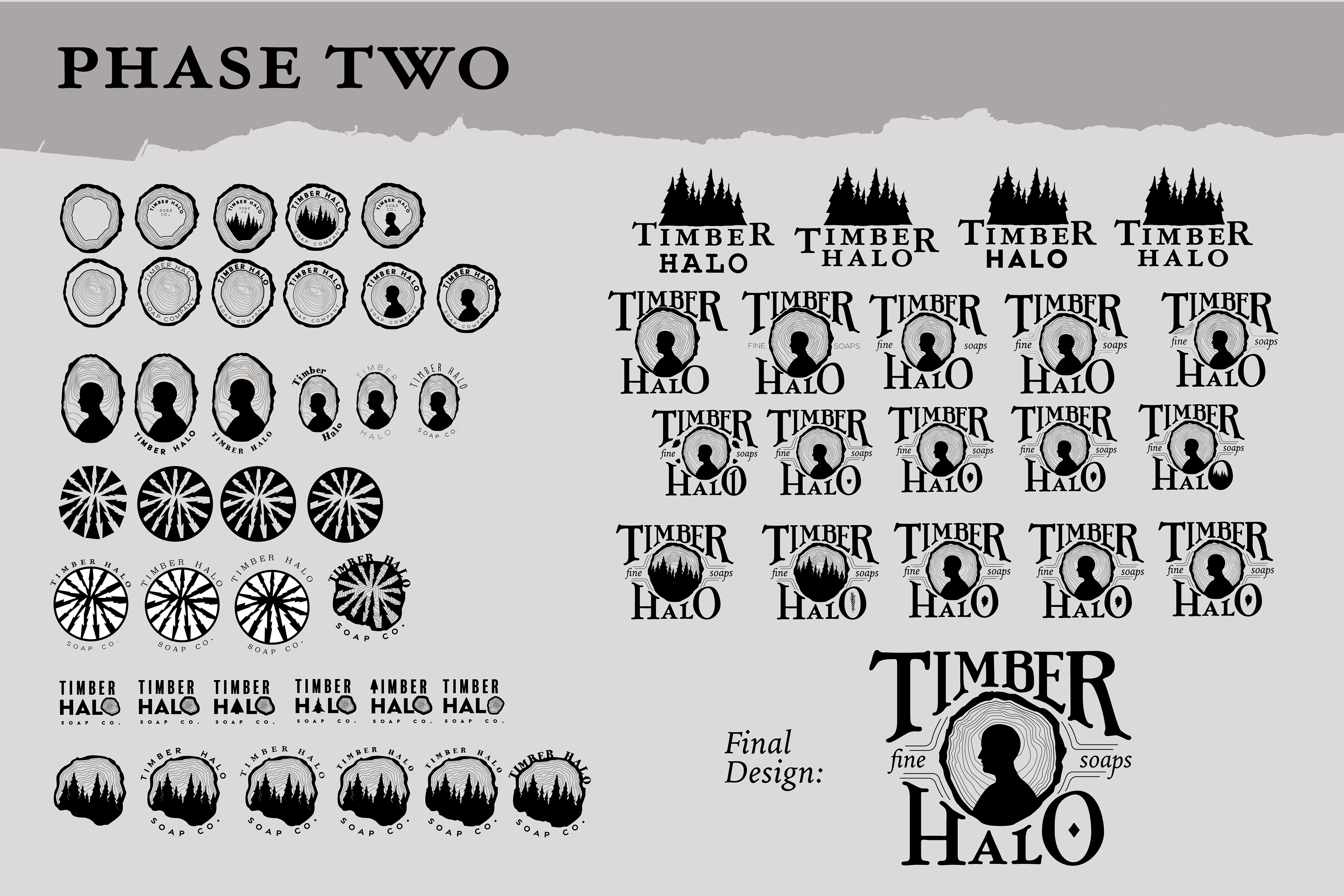
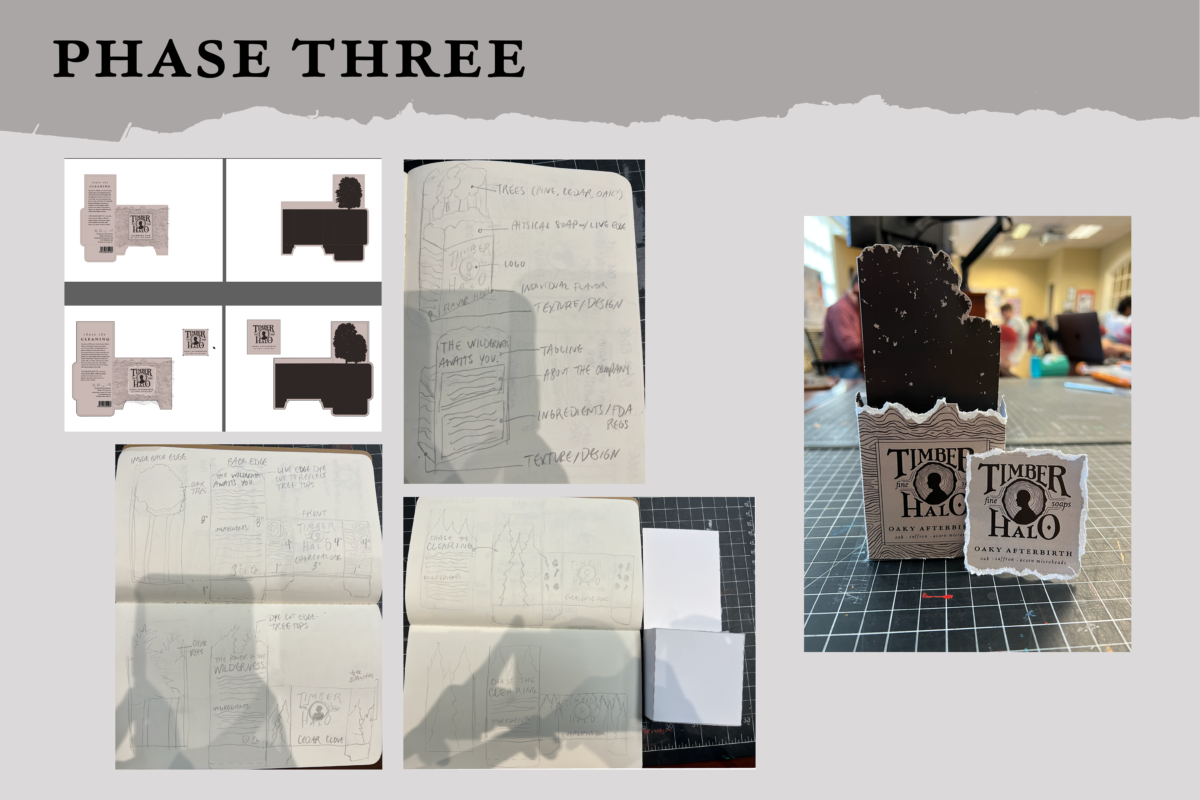
My design process began with the creation of a creative brief highlighting the values and personas that this soap brand is tailored toward. Phase two of the design process included mind mapping and sketching 20 initial logo ideas, vectorizing the best of the sketches and creating at least 4 variations of each vector. I landed on a logo that represents a silhouette surrounded by several halos that are also the rings found in the cross-section of a tree. I chose a very natural color palette to highlight the different kinds of soap developed around different types of trees. I then developed the soap package, which I wanted to be open-faced to showcase the rugged top of the soap in order to have a very strong shelf presence.